When visibility becomes a structural problem
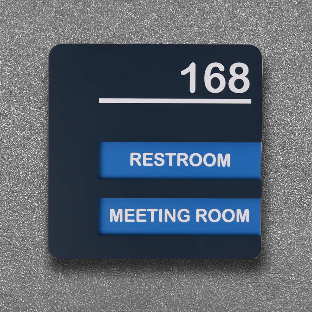
Big illuminated facades promise clarity: bold type, LED depth, a skyline that reads like a score. Yet those same panels introduce real stresses — wind load, thermal cycling, attachment fatigue — and they complicate tactile access for people who need braille and tactile signage. The problem grows when wayfinding is rolled out en masse across campuses, hotels, or transit hubs without coordinated standards for sign substrate, mounting hardware, or contrast. For practical examples of compliant tactile solutions see ada braille signs and ada room signs. The problem is both aesthetic and civic: millions rely on clear signage for safe movement — the CDC reports roughly 61 million U.S. adults live with a disability — and the law (ADA, 1990) backs that need with technical mandates.
Where bulk digital wayfinding usually trips up
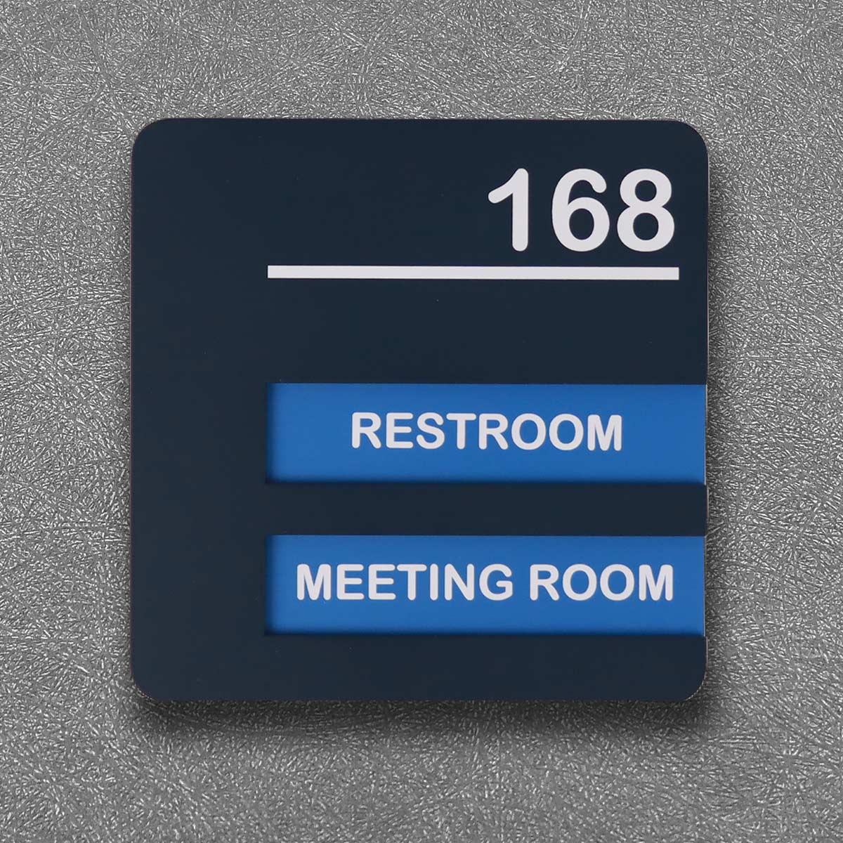
Design teams push pixels and vendors push panels, and somewhere the tactile needs get deferred. Common failures are straightforward: insufficient contrast; braille placed too close to illuminated edges; weak anchoring that transmits vibration; or materials that blister under heat. Each failure type maps to a set of engineering fixes — different sign substrate choices, revised mounting hardware, or shifted sightlines — but they arrive late if the procurement bundle treated digital facades as purely graphic assets rather than mechanical systems.
Calibration as craft: materials and testing that matter
Think like an instrument maker. Specify substrates that tolerate UV and thermal expansion. Detail mounting points with redundant fasteners and vibration dampers. Confirm tactile signage meets stroke height and dot spacing for braille, and test contrast with real human users under varied lighting. Prototyping is cheap compared with retrofitting an entire wing of an airport. Use wayfinding mockups on façade sections, monitor them for wind-induced resonance, then iterate. Real-world anchors help: hospitals and large transit hubs often run multi-week trials before commissioning — that procedure reduces surprise failures.
Design workflow: weaving structure into the graphic brief
Start procurement with structural criteria, not after the artwork is done. Require suppliers to submit load calculations and thermal displacement figures alongside visual proofs. Tighten the handoff between graphic designers and structural engineers: call out attachment zones, maintain minimum clearances for tactile signage, and declare sign substrates by engineering class. This reduces change orders and prevents misplaced braille plaques that deviate from required mounting hardware or sightlines — a costly compliance gap.
Alternatives and common mistakes — clear, not flashy
Some teams chase thinner panels for elegance; others choose oversized LEDs for impact. The alternatives worth considering are simple: heavier-duty substrates with engineered slip joints; recessed lighting that preserves contrast while shedding heat; modular panels that can be removed for maintenance without disturbing adjacent signs. Avoid these mistakes: treating braille as an afterthought, under-specifying anchors, and trusting renderings without field tests. Small choices in mounting hardware or sign substrate scale into big liabilities when applied across dozens of façades — which is exactly the cost you’ll pay if you ignore them. — A modest check now sidesteps a costly retrofit later.
Three golden rules to evaluate any bulk wayfinding program
1) Structural Compatibility Score: demand published load and thermal displacement data from vendors, and accept only solutions with documented resonance control and rated anchors.
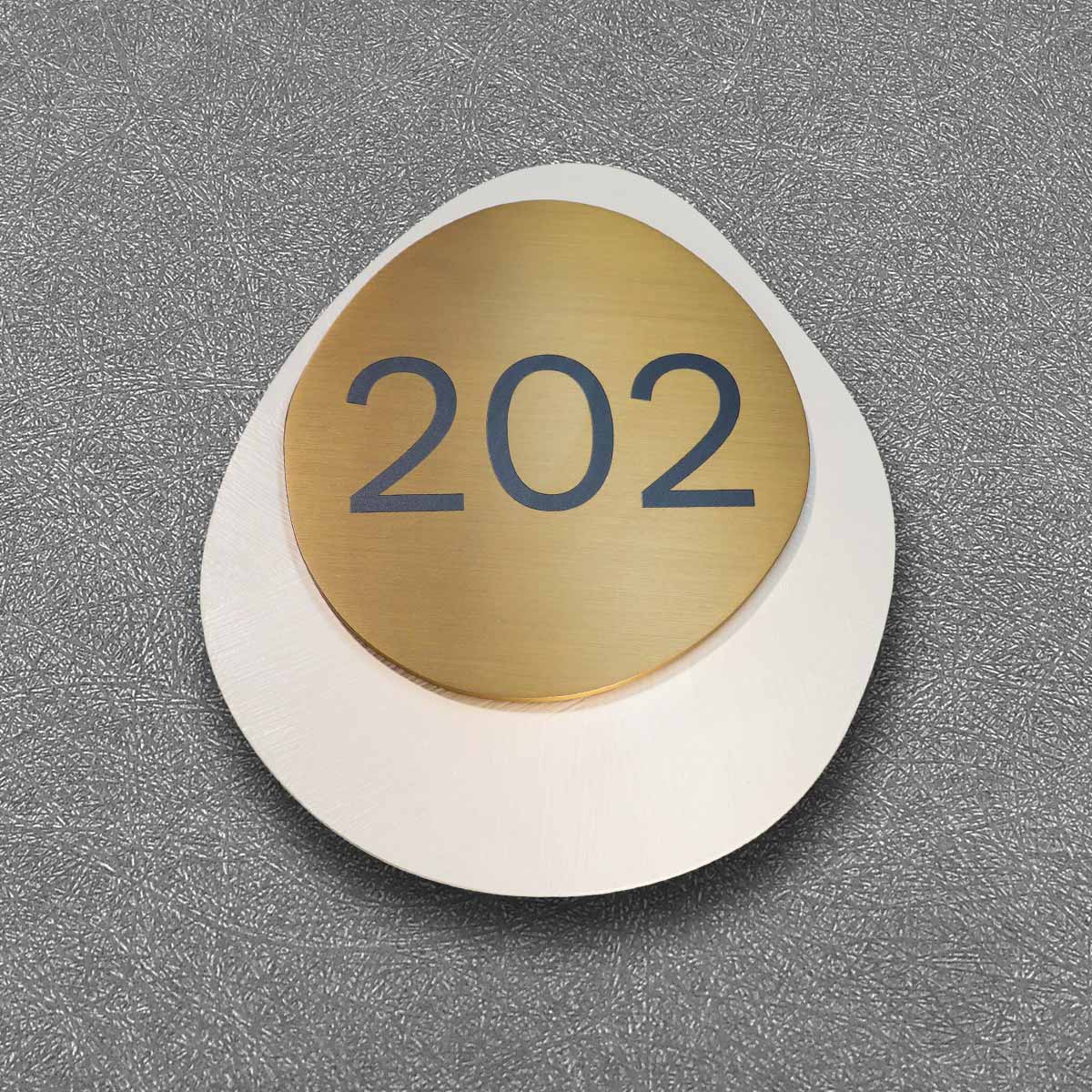
2) Accessibility Verification: prioritize tactile signage compliance (braille spacing, tactile character height) validated by user trials and measured contrast tests under actual lighting conditions.
3) Service Modularity Index: prefer panel systems that allow field replacement of modules and mounting hardware without whole-façade removal; that metric predicts lifecycle cost and downtime.
Follow those rules and you get predictable maintenance, fewer compliance potholes, and signage that endures. The engineering is precise; the result is humane. Cosun Sign fits into that workflow as a supplier that treats tactile, structural, and visual needs as one integrated instrument — proof that design with mechanics in mind delivers clarity that lasts. —